The Fallacy of Simple User Interfaces
Contents
A half a year ago, I've been challenged with improving functionality of a piece of software without making its interface more bloated than it already is. That made me thinking about the complexity of user interfaces, how it affects the acceptance of the software, and what should programmers do about it.

Even Catholic Church pays attention to "User-Friendly Features"!
I'm not a UX specialist of any sort. But, I was a Gentoo user once. Gentoo is a Linux distribution that is famous for two things: 1) it is very flexible so every user can only build a part of the system they need, and 2) most installation/configuration operations are performed from your console via CLI tools (at best) or editing text files (at worst). I found out that long-time Gentoo users who are finally tired of it develop a picky taste for really good user interfaces. So I hope that my thoughts on that matter would be somewhat useful.
Why Do We Want The Interface Simple?
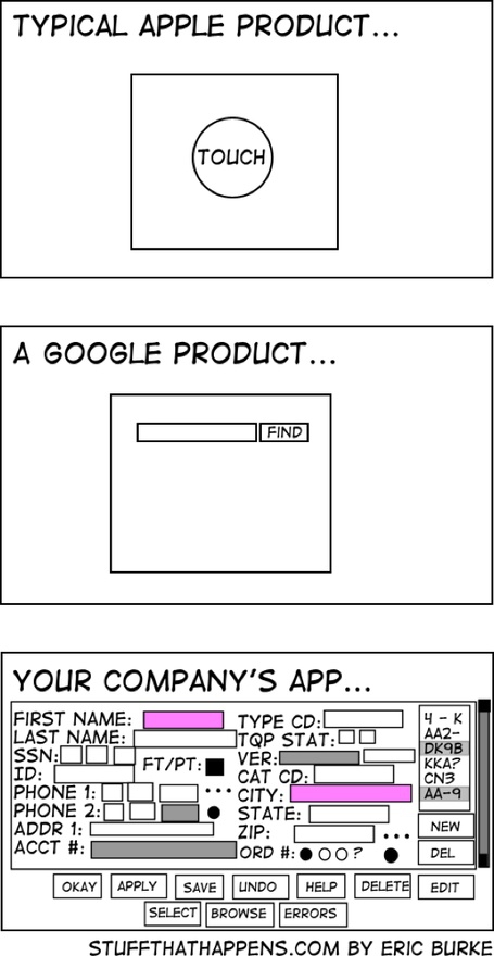
The famous cartoon on complexity of interfaces.
There is a cartoon that explains it all (like many other computing-related topics), which is linked in sidebar. Complex interfaces are annoying. They make people think, they make people actually fill endless forms, ask questions about it, satisfying the kafkaesque bureaucrat monster minds behind designing them. Remember all the "forms" you had to fill at consular sections, customs, and other public offices? They usually come with an instruction how to fill them twice as large... Well, the complex interfaces of computer software are even worse because they change as you interact with them!
Note that I would like to talk here about a broader concept than just "interface" as what user sees on a single screen. In this post I actually talk about User Experience (UX), which includes but is not limited to how forms are laid out. Instead, its concern is holistic evaluation of how user interacts with software throughout its whole lifetime.
Of course, most things you fill into these forms is necessary. Compared to Google search bar, which is approaching just answering a question you put there, they seem like getting to 20th floor by stairs compared to 2nd. But (provided the system cares about the citizens), these government guys really need that information you're to fill in into each form. Being long doesn't mean being complex, and a long-ish questionnaire really makes the user think less than a freetext field to enter your essay.
Bad Interface as a Programmer's Failure
So there is a huge class of problems where a complex, comprehensive interface is the answer. At the same time, there are complexities of other sort, which do not have any right to exist, and should be perished from each and every product by all means possible. It is when we make the user do our job, to follow an algorithm. Making machines follow algorithms is our job as programmers. We are paid for it, respected for it, and despised because of our devotion to it, but it's what we are to do. Note the emphasis on the word "we". We, not our users.
If you have to instruct your user like this, "if this checkbox is active, then you should set this flag; otherwise, set that flag", or "when you select this option, click the button below as well," then you are implementing a monster your users are going to hate. An only excuse to putting such decision is that you should build the tool immediately, and are going to improve it ASAP.
Not your job, actually? There are designer guys, User eXperience managers who should think this through rather than you? But do they really have a foundation that allows them enough variation? Don't they have to lower their expectations of what they can design because some of their ideas would require too costly architectural changes? I'm sure you at some point had a talk like, "Whoa, we can't implement this! It would require too much something!" Well, what it sometimes actually requires is additional effort on our part. We can--and do--affect whether the software is hard to use and has a handy interface, and you should be aware of that power in your hands from the very beginning. It's easy to screw up, and put too much limitations, and then ditch all interface improvements because their cost will rise.
Smells
Some designs are definitely programmers' failures. Look what I saw trying to transfer funds from one account to another in my online banking:
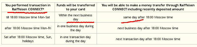
What's so damn hard in telling me when my transaction is going to complete if I perform it NOW? Doesn't the web server have access to clock??? Especially if it refers to a standardized time, but it could look up my local time via Javascript either. Why is it making *me* to look at my watch, and compute the date my transaction will complete? I know how programmers in banks are paid, don't tell me they aren't qualified to do this. It's just a lack of understanding that interface is bad if the user has to follow some kind of program rather than have a computer do it..
In my opinion, there are two smells that denote that your interface is wrong. It's badly designed if
- you write policies and instructions instead of preventing mistakes programmatically. The designers of industrial machines got this ages ago. In addition to writing in big red letters DO NOT PUT YOUR HANDS HERE, they just install a damper that prevents you from doing this. This has been saving lives and limbs for centuries;
- the interface can have a large number of inconsistent states. When you act upon a control, something changes in the interface, i.e. the interface's state changes. If your interface allows that in a comparatively large number of cases a state is inconsistent with your policy or your intention, or is just meaningless, it starts to smell. The fewer meaningless states you have, the better your interface is.
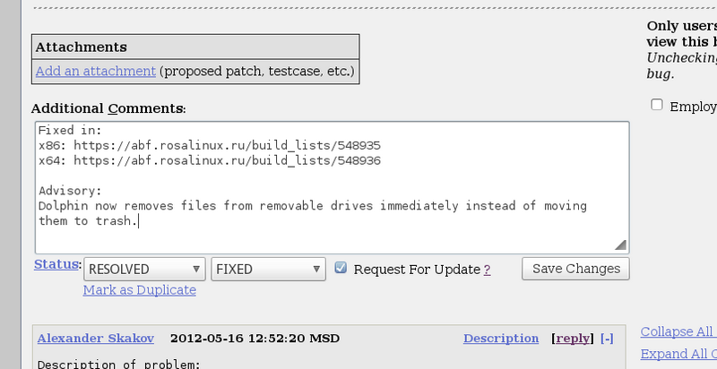
I tried to implement "Request an Update" checkbox Bugzilla extension for ROSA Desktop so that it follows these guidelines. The checkbox is disabled when there's no enough information in the comment, and that one checkbox (one bit of information) correctly requests an update and notifies the interested party regardless of what stage in the overall workflow it's in.
Of course, more established distribution maintenance systems, such as Bodhi or Launchpad are even simpler, but that's nearly the best you could do with a small patch to Bugzilla.
The reverse doesn't hold. If all states are meaningful, it doesn't mean that interface is already easy enough. It may lack handiness, expose too many parameters, greet users with insane default values. However, if it's too easy to make the wrong choice, the interface is definitely awful.
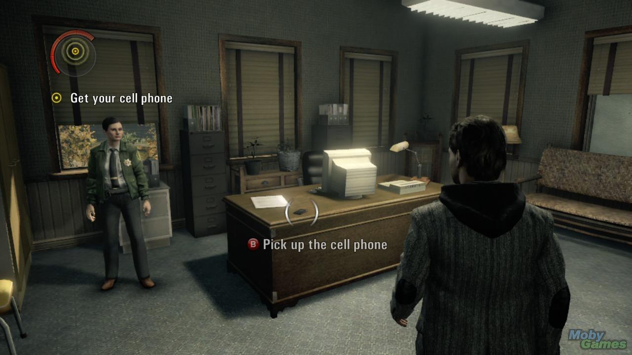
A somewhat modern Alan Wake game (I highly recomment it). The action item is highlighted, you don't need to hunt for it—and frankly this does improve the gameplay. Screenshot courtesy of MobyGames.
Game designers got it recently, and modern games highlight action items for you, expose less options where to go, and always provide an infinite box of ammo if you are to shoot your way through. The result? I see advertisements of Borderlands 2 on a bus stop. Gaming is no longer for nerds only!
Another case is automating the processes user shod not understand. One of these cases is installing drivers. Most of the time you install Linux, you have to install a proprietary driver for hour video card, and all the manuals say you should select the correct one based on its make. These manuals even provide you with instructions how to learn which video card is installed.
Why in the world can't the software look this up, and choose the correct video card on their own? New hardware comes out, and you can't know the names beforehand? Well, do guess! You think that casual users are smarter than your gueses? You update the wiki pages with instructions, why not update the software at the same time? No reason.
Back to game developers, they all bundle the latest version of DirectX, and automatically install it along with tge game itself without any, unnecessary questions asked from the user. Assassin's Creed 3 on billboards all over the city; that's the result.
How Easy Should the Interface Be?
Note that I didn't say anything about complexity; why? Some people think that the complexities of interface is what prevents others from using a product. This is an easy explanation. Many dream about a "brain-machine interface" as it would solve all problems with the complex interfaces. Myriads of buttons, overwhelming amount of gauges and interactive controls, and warnings like "your signature must fit completely in the box" will be useless because the answers to the questions would be transferred directly from human brain.
Contrary, the brain-machine interface is going to solve nothing. Because most users just do not have any brain.
The brain-machine interface does not jump over a barrier unachievable by other means. It is a result of gradual convergence of the means of control and our thoughts. The simplification of interfaces we see nowadays merely exposes the truth we should have unveiled years ago: if our thoughts are a mess, then a simpler interface doesn't solve anything. The interfaces are getting more and more simple, and people's persistent incapability to cope with them frightens me. I mean, are we really that dumb?
Since the user is going to be the problem, there's just one thing to do. To increase its knowledge. Extended to many systems, it could be called as increasing the likelihood that a person who encounters a system will infer the principles behind it, and starts asking the right questions.
One of the things that surprised me when I tried to deploy a wiki software in an office was that people couldn't create a page. I'm not sure if it was just an excuse to dodge a mundane job, but users reported that they couldn't find a button "Create New Page". Mediawiki, which is the software behind Wikipedia doesn't indeed has this button. Why? Because, unlike Google Docs, wiki is a set of interconnected pages, so pages not linked from elsewhere don't make sense. So the correct way to create a page is use it as if it's already exists, put a link to it. That simple and tricky at the same time.
What I think my failure was is that I didn't show how to use the wiki pages, didn't educate users. Without cross-reference, wiki pages are inferior to Google documents, which puts the whole idea into jeopardy.
No matter how simple your interface is, it is never going to be less complex than the concept behind the software. Search engine and other information-retrieval system are lucky: their concept converges to a single line of text (or a verbal query) where user enter what they need to know. Such systems then automatically suggest if user was looking for videos, images, and/or nearby shops (like Google currently does). However, when the concepts of information behind the scenes become more complex, such as maintaining a set of interconnected pages (wiki), or adjusting privacy settings (Google Plus).
So What?
So here's the list of things I would keep in mind as a programmer to make the interface of the product better:
Code With User Experience in Mind
Consult UX specialists early and often. Make sure your coding decisions you made at earlier stages of development do not prevent improving user experience after you get alpha-version feedback. The attitude "let's get it working first, and then think about User Experience," can easily lead to inability to actually improve it. It will be very easy not just to say, but to show with compelling evidence that you can't improve your interface because your code doesn't allow that. But really, putting code in front of User Experience is like putting the cart before the horse.
Convenient interface (or, let's say A Better User Experience) doesn't only mean that your knobs should be shiny. For instance, Google is famous for the speed of its products. Apple's interfaces (Mac, iPhone) are faster than many other their competitors (modern powerful Android phones changed it though). And it's not just convenience: being slow may even kill your project, as, I think, it killed one of mine.
And isn't it the most straightforward task for programmers: to make the gears faster?
Provide Early Response for User Input
If your user has to follow the rules when filing something, provide feedback ASAP. Don't make user click "Next" and only then receive response. Don't punish users for providing incorrect input because you think they should have read about the exact format for entering their SSN. Such approach is abomination. Do you really want your product make the same impression as an embassy where you apply for a visa or a public office full of nine-to-five clerks with their "read 10 pages of how to submit an application, and we'll reject it without explanation if something is wrong"? No, you don't.
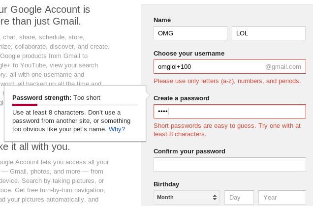
That's why you provide pop-up hints, color input fields red until user gets it right. Just take a look how New Google Account window hints you and checks your input as you type, even before you reach the "Submit" button:
Decouple Rules From Code, Make Them Configurable
If your user should follow some rules (mainly when providing input to forms), try to make them re-configurable in a declarative style. This is important since the rules tend to change over time, though, I wouldn't say it's crucial. It's hard to get, too, especially since the previous section suggests that you should tailor your feedback instead of just verifying your model. Just make sure it doesn't end like this:
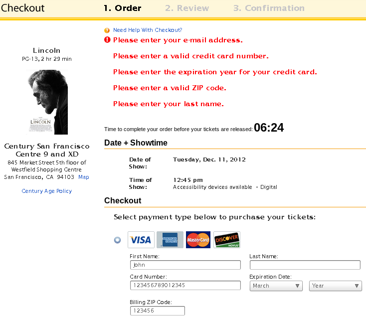
Credit card validation is my pet peeve... Why can't you tell me, "Sir, you missed a digit?" You know exactly how many digits there should be. But instead you're telling me something I can interpret as, "Your credit card is blocked!" This one, at least, doesn't ask me explicitly if I have a Visa or Master card, because you can learn it from the number I enter. Good girl.
Apparently, form validator they employed for that checkout page made it so hard to configure nice just-in-time validations that they resorted to the abomination of "error messages for the form". Of course, that's an additional challenge: to make this configuration just flexible enough for your purpose (, and here's where your judgement, as of a professional, comes to play. I thing that flexibility is one of the reasons "cancan" wins over "declaratice_auithorization" in Ruby on Rails web authorization plugins: the former is much more flexible and easier to configure.
Educate Your Users
If the concept your software tries to manage is complex, then simplifying the interface will only increase frustration because user will feel like he doesn't have sufficient tools to tailor the information to its needs. Instead, invest time into making users more informed. Make educational, not promotional videos; Talk at conferences, explain the concepts as soon as users encounter difficulties automatically by popping out videos. The thing is that, even if your interface is not ideal yet, it will never become simpler than those concepts, so it will never hurt to explain them. You can also pop up a chats with customer representative. The latter was recently employed by many service providers, and now their websites pop up windows offering human help if you are lost while browsing the site.
You think it's a job of your PR manager, not yours? Well, are you sure your PR folks understand the concepts in the first place?
Conclusion
I tried to summarize my thoughts on what makes a good user interface, why the simple interface isn't necessarily the best, and what to do about it as a programer. And you really can do a lot to improve the interface of your software: devise the ways of automating figuring out unnecessary details (such as video card make) for your users, improve speed, explain the concepts behind and typical use-cases. And, as a programmer, your unwillingness to deal with this can destroy your project, well, just as many other things you fail to take care of can.